Main Content
We will start by building the main page of our personal presentation, since this will give the main structure to the whole website design.
We are going to design a personal portfolio page with a main menu, content, and a footer. We fill in the content with an image along with some text.
We are going to do all of this with HTML5 elements so open up a HTML5 cheatsheet and keep it handy.
We will start by building the main page of our personal presentation, since this will give the main structure to the whole website design.
Start a new directory for this project, alongside the example1 directory you’ve been using so far. Call the new directory something like portfolio. Copy the files from example1 into the portfolio directory to use them as a basis for your new project.
After you have the files copied into portfolio, edit the HTML page there and remove all of the body content (everything inside the body tags, so you have an empty page with just the meta tags, title, and the CSS link tag.) We can use this as the basis for a new page.
Let’s start by wrapping our page in a div to give a centered design to our page. “A div tag defines a section in a HTML file and is used to group elements to format them with CSS in order to lay out a web page.”
Div is a general tag and can be used in many different situations just to wrap together a group of HTML elements and style them. For this reason we need to give it a name; otherwise, we can’t style each one in a different way. There are two ways to give a name to a div tag: with an id or with a class. Think about an id as a personal and unique name like your surname/name and think about the class as personal characteristics, such as the color of your hair or your age. Id, the unique one, is used when you need to write a specific style valid only for this element. Classes are more common and used to give different HTML elements the same style and characteristics.
We can now write our main page content:
<div id="wrap-centered">
</div>
Since we have just one main content, we can use the ID selector.
In styles.css we make this div always centered in the middle. To call the class in CSS, we need to write . and the class name just after it. For the ID it is the same but with # instead of ..
#wrap-centered {
    width: 100%;
    margin: 0 auto;
}
Here we define the width of an element and then give it a margin: 0 auto which is a common rule to center the element. We use 100% instead of 100px because we want our page to be responsive or, in other words, we want the page to resize when the browser windows change dimensions. Now everything inside this div will be centered.
At the beginning of the styles.css file, let’s write something like this:
* {
    /* don't use '0px' or any other unit, if you set the value to zero */
    padding: 0;
    margin: 0;
    border: 0;
}
That is to set all the elements * with default padding, margin and border to 0. This can be really useful to do because every browser sets a default size for some tags, and without setting all of them again to 0 it will be impossible to calculate the position of HTML elements and to position them on the page, since every browser will interpret that in a different way.
Finally we start to build our content. First of all some structure. We are going to have a two-column design: one column is a kind of sidebar and this tag is called aside and the other one, the most important one, is a section wrapping up several articles. In order to have more control of this two-column design, wrap all of it in a div element with a content class and give it some basic CSS, as we already did for the wrap div.
Tips: When you are not sure if your CSS is working in the proper way and you want to check exactly the size, margins or something else of your element, give it a casual background color, so that it displays the entire element.
<div id="wrap-centered">
    <div class="content">
        <aside>
        </aside>
        <section>
        </section>
    </div>
</div>
In styles.css:
.content {
    width: 70%;
    margin:0 auto;
}

aside {
    width: 35%;
    margin: 20px;
    border-right: 1px solid #000;
    min-height: 300px;
    float: left;
}

section {
    width: 55%;
    display: inline-block;
    padding: 10px;
    margin: 20px 10px;
}
First, we gave a size to the content and placed it in the middle of the page. Then we gave the aside tag some margins to allow the content to breathe along with a minimum height and width. We also highlighted the border-right of this element so that it displays a line that divides aside from section. Last, we gave a float: left; in order to make the section (or whatever we will write after the aside) slip next to the aside, right on its left. It is really important to set display: inline-block; for the section.
In the aside let’s place an image, our personal profile image.
<aside>
    <img src="me.jpg"/>
</aside>

img {
    width: 272px;
    margin-top: 10px;
}
When you don’t know the size of your image, you can place it and then open your console and check from there, try out different width sizes and see what the best width is. Of course, the best way to do this work is to crop your image before, knowing the size, with some graphic editing programs like Photoshop or GIMP but for now that is enough.
Time to write your personal presentation!
<section>
    <article>
        <header>
            <h1>Title</h1>
            <h2>Second title</h2>
            <p>Hello hello hello</p>
        </header>
    </article>
</section>
Here we put inside the section an article tag. Each article tag is composed of a header tag, a tag that is made for wrapping up all the h tags. So we place inside of it an h1 and h2 tag. Followed by a p tag where finally all of our content is written. Write at least some text inside of your article, because we will need it later on.
Before we make our article better looking, we need to know some basics about the box model. What is a box model, and why is it so important?
Every element in web design is a rectangular box. (Yes, both block and inline elements. You can set paddings, margins and borders on both of them.) In CSS, the term “box model” is used when talking about design and layout. The CSS box model is essentially a box that wraps around HTML elements, and it consists of: margins, borders, padding, and the actual content. The box model allows us to place a border around elements and margins and padding around this element too. How is the size of the box calculated exactly? Here is a diagram:
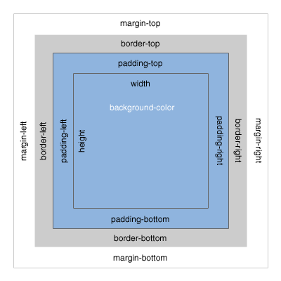
What do these elements do?
Margin is unique in that it doesn’t affect the size of the box itself, but it affects the other boxes on the page.
The size of the box itself is calculated like this:
Width: width + padding-left + padding-right + border-left + border-right
Height: height + padding-top + padding-bottom + border-top + border-bottom
Tips: Remember to set all of these elements to 0 when you start your .CSS files as we did at the very beginning.
So, now that we know how to calculate the box around our elements, let’s play with the boxes around the article, header and h tags.
Text style
The text in the document is still pretty boring, so let’s style it. What we already know so far is how to change a color and how to make the text align to the center. As you probably already have understood, the other values of text-align are left, right and justified; by default the value is left. When text-align is set to justify, each line is stretched so that every line has equal width, and the left and right margins are straight (like in magazines and newspapers). An important decision to make is which font we are going to use for the project. You can specify the type of font with the font-family property.
There are two types of font family names: generic family: a group of font families with a similar look (like Serif or Monospace) font family: a specific font family (like Times New Roman or Arial) To specify your font you have two ways. One way is to use a common family-font (one with a high probability that all users have on their machines) called a “web-safe” font. Or use a font-face rule. That’s a new property that allows a designer to include font-family on your server and refer to it. This second way was a small revolution, since it gave the designer the freedom to choose the font they prefer and now we have a huge choice.
For now we are going to use the “web-safe” font since that is easier and faster. Tips: If you try to use a particular font that you download onto your computer, and it display correctly–be careful because on other people’s computers, it probably won’t. The correct display doesn’t come from the browser but from what’s on your machine.
h1, h2 {
    font-family: Georgia, serif;
}

p {
    font-family: "Trebuchet MS", Helvetica, sans-serif;
    font-size: 0.9em;
}
And here we can already see the other really important property: font-size. As you already understood that sets the size of the font of your selector. Browsers have a font-size set by default but it is important for a good look to change these defaults. You should not use font size adjustments, however, to make paragraphs look like headings or headings to look like paragraphs. The font-size can be set using px, em or %. Your screen resolution specifies how many pixels your screen/display is made of. So when you specify: font-size: 12px;, you’re basically telling the browser that each letter should be 12 pixels high. That is therefore connected with your screen size. Font-size: 50%; sets the font size of your element to 50% of the font size of its parent element and em is the width of the letter ‘m’ in the selected typeface. It’s basically the same as percentage, except that 1em is 100% and 1.5em is 150%. To calculate the size from pixels to em, use this formula: pixels/16=em. For example:
h1 {
    font-size:2.5em;  /* 40px/16=2.5em */
}
It’s hard to tell you what you have to do with the sizes, because it is hard to tell what you want to achieve in each of your layouts. Layouts are about creativity, and you can’t just have one approach for all of them. For now we can say that it is better to use em for a font in these days since the user has so many different devices and screen sizes that this is the easiest way to make the font-size automatically resize-able.
A good solution can also be setting a font-size: 100% in the body element and then use em for each different selector so you start in every browser with the same size.
Ok, now it is time for you to play, modify and create your font style. If you want to try something more, you can check your cheat-sheet and discover other font- text- properties.